Practical
Task 1
Task 2
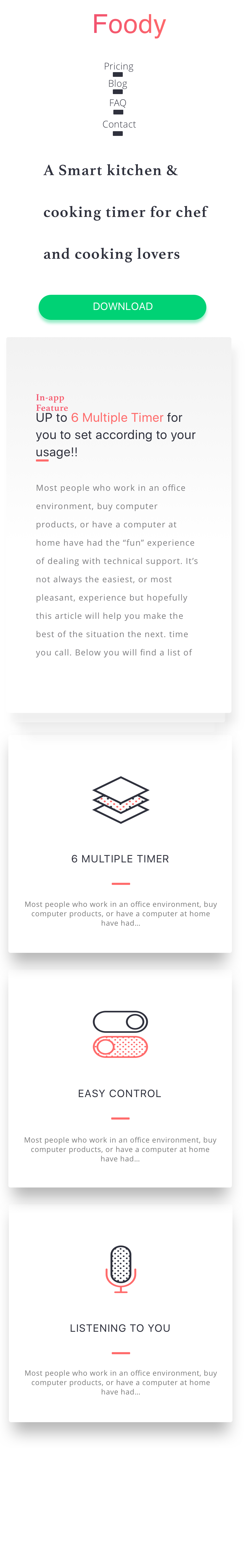
You are required to make a responsive website that resembles the mock up below

Do not forget add the
<meta name="viewport" content="width=device-width, initial-scale=1">tag in the headerWe will only have one breakpoint which will be triggered
@media (max-width : 400px) { }
Setup
The style guides and mockups should be downloaded from here
The assets for the project should be downloaded from here
Task 3
At this juncture you should have laid out the foodie website. If you have not done this re-visit the task from week 2.
We are now going to make this website responsive. Use a single breakpoint of 'max-width: 700px', anything below this width should be considered a mobile device. The image below will give you an idea of what we are trying to achieve. Notice how we are hiding unimportant elements such as the phone image.